
Currently, we use MailerLite as our primary software for building and sending emails to our customers, both professionals and enterprise. Below are some guidelines and downloads to help you create emails that are brand consistent.
The following templates are stored in MailerLite and can be applied to all campaigns. Once the template is applied, the template can be adjusted at the campaign level without affecting the original template itself.
This template is ideal for web alerts, software announcements, and other non-visual communications. Although images are allowed, this template was design to be without images.
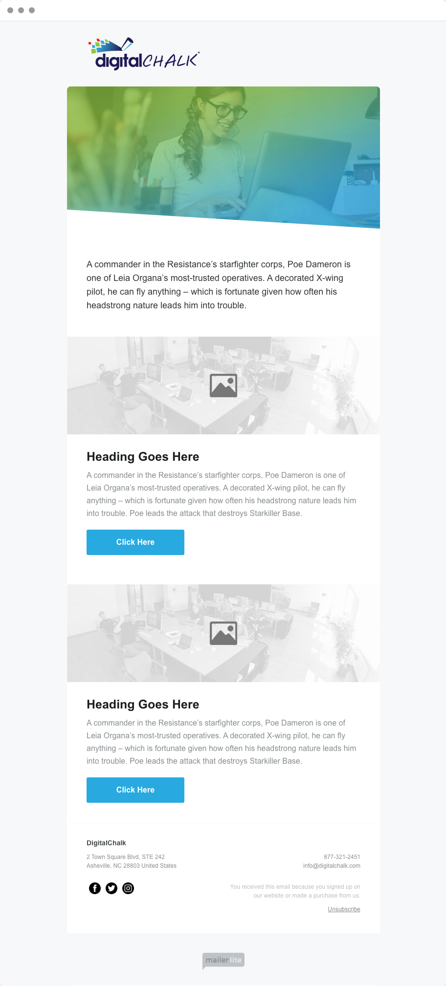
For more visual campaigns, this template provides a number of duplicatable blocks meant to capture both images and text. The text includes headlines as well as buttons. This template is ideal for software enhancement announcements and new features.
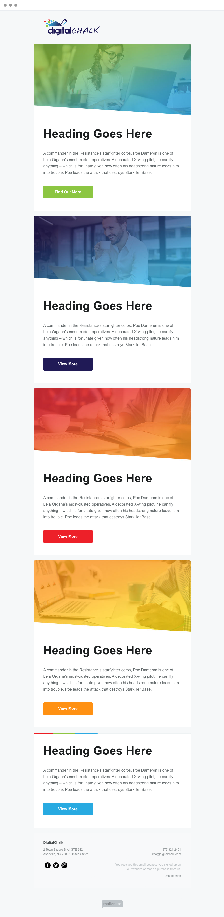
This template has all of the block designs as the “Features” template, but the blocks are divided into cards. This is ideal if the blocks need more contextual separation. Otherwise, the other template should be used.
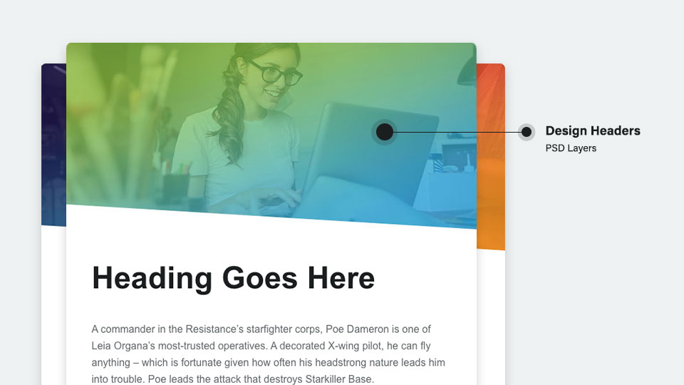
Below are some Photoshop files to create the email headers (both block and card styles). The files are layered. Each layer contains a gradient style using DigitalChalk brand colors. Once you have inserted the photo and made adjustments to the opacity to match the existing photo layers, you can save for web and insert into the email campaign.
Below are some best practices when for use when building an email using MailerLite’s drag-in-drop software. When a template is chosen, these practices are set by default. However, in some cases, you may need to add new blocks or customize existing ones.
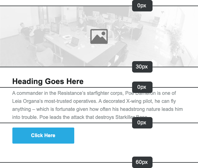
Padding between sections should be larger than spacing between section parts, which is relatively consistent. In this case, 60px is used to bring separation between this section and the next.
In most cases, text and button alignment should be left aligned. In special cases, center alignment is permitted, but all content in the email must be centered.
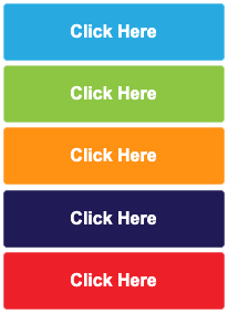
Use brand colors for all button backgrounds and maintain consistent color schemes with the marketing website. Buttons should always take the alignment of the surrounding text. Color is prioritized on the left. Button labels should also be consistent with the marketing website when applicable.